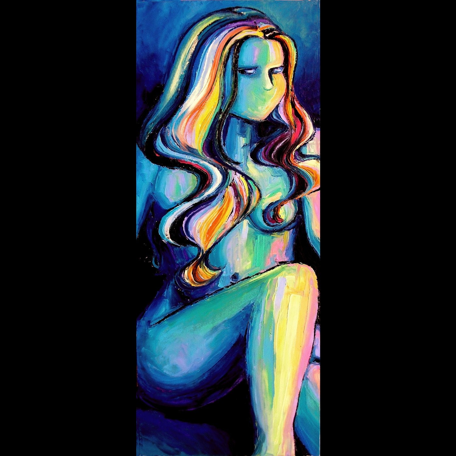
Saturday, 20 October 2012

Review for the Observational Drawing


Review/Reflection
1)      Experiment  of oil pastel – A3
This is probably my favourite piece of experiment as the technique of oil pastels  conveys the style of Aja’s painting really well. This art work is inspired by this artist as I liked her style of abstract expressionist painting. The work I've created is done by oil pastels in which I've drawn in various lines of different colours that show the dark colours to light to represent the cold areas to warm areas.  There’s is  bit blending involved in some areas to get an evenness of colours through her to show the curviness and the smoothness in which it make the structure more realistic and bold. I've chosen this pose to be developed as it matched the idea of the colours,to convey the warmth and coldness.
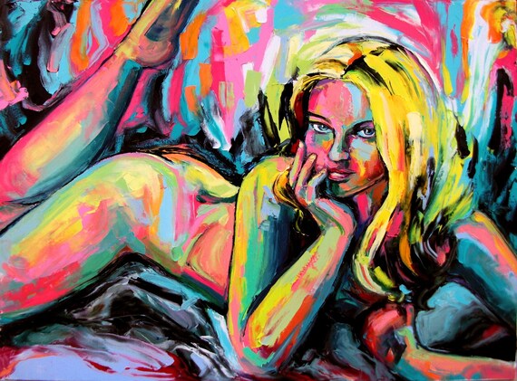
2)      Experiment of acrylics-A3
This piece of work is also influenced by the style Aja’s work of art which can be seen through the technique I've used again. This experiment is done through the change of media which being acrylic paint. In this piece of I've wanted to show how the difference between the oil pastel piece and to acrylics, in which I've found that the paint consistency was very light and quite dull and the colours didn't seem that strong enough to be seen and didn't t have an outstanding look like the oil pastel technique. On the other, you can see the blending of the colours together very well.

3)      Experiment of finger painting- acrylics
This development piece is created through finger dipped into the paint then onto the paper which is meant by finger dabbing. This was a quite fun but also finger straining way of painting. It was also difficult to create detail to this piece of work as I couldn't make small parts detail although I have managed to add shading to the figure. I've chosen strong colours for the background as it made the body structure standout and wanted to give dramatic effect . However, I've chosen more of a subtle colour for the figure as it supposed convey the body language in the sense she is lying down and resting calmly . The contrast between the background and the figure also the warmth and the coldness in which again it conveys that she aren't dramatic in this piece of work. I think the work fairly came to good standard

4)      Experiment of soft pastel
This piece of work mainly considers the shape of the woman’s body against the background as I made black shading throughout by rubbing my hands over it.The figure itself was created to be centre of attention as the various stream of colours supposed to convey the different emotion through her as I've created lines that swishes with different colours. I've added a chair, so that she wouldn’t be floating in an empty space. The work came out to really well and I enjoyed working out in this technique.

5)      Experiment in watercolours
This experiment was based on Madison Moore work in which the background influences her style of painting although I've changed it  and gave it my own style of painting in which I've used water colours to express the subtleness The technique I've made for the background was a different wash of colours that gives the same effect of Madison Moore’s kind of style. The figure was meant to be combine in with background but I've decided that the blue lines should come out more and stand out to show the figure in which I've used the a navy blue colour to represent of the organic shape. I've quite enjoyed working on this experiment as I like working with watercolours.


Monday, 15 October 2012

Aja from the Sagittarius Gallery (Artist Research)


Aja’s work shows a lot of consistency of various colours in which it is expressed through the different postures of the feminine figure. The atmosphere of her work shows lot of joy and excitement. It also enlightens the subject through in the way it’s painted. The bold use of colours shows the Individuality and represents her sense of personality.


This artist is not known as a famous person but has a wide range of work that shows her individuality. She is from Schenectady, New York. Her name is Aja and her works been published in a Gallery called Sagittarius in Scotia, in New York. As the owner of this Gallery she started doing her business at the Sagittarius gallery in 2003 April. She has shown her work in various galleries such as the world momentum fund gallery, Prince George in ballroom in Manhattan and many more in different places. Her work is also published in the ArtNEWS , American art collector and so on. She was mainly interested in abstract expressionist painting and looks at her main influence by Mark Rothko, was a Russian -American painter from the 1903.


The media she uses are mainly oil paint and a palette knife which can be seen through the texture it creates as it is very flat and bold with block bright colours that convey different aspects of emotion and atmosphere as some are shown in dark colours to the bright colours which characterize the shadow and the light areas. The work also shows define detail of the features that is need to be seen with an outline of black paint. The contrast of the bright colours against dark makes it very outstanding in which it looks realistic. The abstractness has been conveyed very definable.  The use palette knife shows some strong thick lines of paint which represent the organic shapes of the body very well. The purposely seen of thick oil paint makes it look natural and gives a lot of texture. She also loves using different media which comes through the same kind like melted Crayola crayons, Testers cars enamels and Sharpie pens.

I've chosen her work as I like the mixture of vibrant colours that is used in her work which influenced me  a lot to get that outstanding look from the use of colours, which can be seen through the work I've created in my development pieces that has been inspired  with this certain style. I love her style of painting as it represents great deal of detail expressed through various vivid colours which go together and gives this amazing look.


Impasto abstract nude oil painting by AjaAbstract nude painting impasto art by Aja
Figure painting abstract nude oil on canvas by Aja huge 3x4 feet

Tuesday, 26 June 2012

Evaluation- Portrait (Photography)


When I first received this assignment, I was pretty curious because I like the idea of exploring at people expression. Our first task was to research this photographer called David Lachappelle, his photography showed a lot of broad unexpected creativity that seemed to show celebrity in another level. Our next task was to take different lighting images in which I learnt how the colour cast worked out, depending on the natural light like the day light and the light source inside. The light pictures was also taken using David Lachapelle style as the pose for this picture was a copy of this picture that you can see my sketchbook.  The other task we had to do was the portrait experiments showing a part of the face and mirror reflection, using windows and mirrors. I've also researched on Vanity Fair and looked at the photographer for this magazine which was Annie Leibovitz and described why her photographs are attractive to look at.

Then we were working in the studio and looked at various position that the studio light can be placed and what kind of effect it gave and how it differ it from others as some were strong and dramatic as the light shines upright to the face and some were from the side lighting which showed a subtle way and gives sense of lightness. Moving on, we researched on George Hurrell photography. In this research I’ve looked at the various pictures he took and described what kind of effect it gave. I’ve found his fascinating as it gave great deal of depth to the picture.

Moreover, we did more Photoshop experiments that would be useful for further working on Photoshop in which I’ve learnt new techniques from Photoshop.

When I had to plan for my final design for this project, I came with a mood board of an idea which was on different postures meaning on how the persons posture gives an interesting look, the source for this idea came from magazine. Then I created a second mood board on various expressions that I found interesting. Afterwards I came with another two ideas that would be great to do in which you can see in my sketchbook, also lead me to give me hard time to choose the right idea that I would like to do as my final idea.
 At last, I've finally chose the design that i would like to see and would attract people to see, this was the idea from the photo booth  photography style in which  me and friend of mine gave wide range expressions to resemble of what kind people we were and gave this fun look of being young.

Overall I was pleased with my final piece but when I had print out my final piece; the quality of pictures lacked and at some section weren’t visible to see which was disappointing but I had no choice and had to put it in my sketchbook. However, the project was very enjoyable and learnt various techniques. If I had another chance to do this project again, I would've arranged some more time to work on my final piece in which to make it to be  more visually attractive.

Monday, 9 April 2012

Chair Evaluation

For this assignment, I’ve looked at different chair designers to influence me with my own ideas for the chair project. I mainly i look at  Charles Rennie Mackintosh chair designer, who created very rectilinear chair and has the modern touch to it which gave me this inspiration to do my chair in the same way and then I’ve looked at this other chair designer called le Corbusier that designed a range  of chairs which showed the curviness of chair and had more a circular shape (biomorphic) which gave the chairs an interesting look. These chair designers influenced to create my own chair ideas which can be seen in the page 12.
We also looked at the general human form as we created a survey using our class mates, which gives an idea, how it might be as the measurements shows the average and if it is the right proportions to sit in a chair.
We also drew an observational drawing of a skeleton that would also show the human form and the averages. From the chair ideas I made some chair Marquette’s which didn't really appeal doing but I managed to do reasonably amount of chair Marquette’s which I was satisfied with.

I’ve created various chair ideas which influenced me to do 4 initial ideas that I might use for my final chair design, my favourite design would have been the first one but I didn’t chose this as my final design as it would’ve took me a long time to do it and it would have been not the chair that everyone would have been  appealing  for everyone. I’ve chosen to do the first design as it had this fairly simple and the modern look to it which would appeal to everyone. While making the chair, had difficulties to start as I couldn't figure out how I would I put the pieces of cardboard together. Unfortunately, I didn’t get to finish my final chair as I ran out of the time.

Overall, I fairly enjoyed this project as I liked designing the chairs in different methods and to find about the various style of making the chairs. However I would improve certain things in this project and would use my time wisely. 

Tuesday, 6 March 2012

Vincent van Gogh


This painting is from Van Gogh was published in the city Antwerp on December 1885. I think it’s about the red ribbon as the colour red makes a statement of who she is and what background she comes from which leads to her life style too.  I think this artwork is about the composition as the pose of the women suggest the shape of her body and show the beauty of her face of the side posture.

This artwork is painted in oil painting.  In this painting there is a lot of thick and thin brush strokes especially in the clothing area and is blended very well in certain areas. The consistency of the paint is very thick. The red ribbon gives a strong effect against the black hair. I think lighting has good effect to the portraits as it has good visual effect as you can see on top of her hair which seemed to show the red ribbon bolder. I think this painting has a lot of depth in the background of this painting as the women seem to be standing in front of a deep green bush and the dark shadow in the middle creates the woman to be the main attraction and show her view through. The use of colour has a great impact as the tone of colours of her face suggests the flawless skin even though she is a fat lady. The colours are very strong and solid and the background colour suggests that it’s very calm and has a cool atmosphere.

Vincent William Van Gogh was Dutch post-impressionist painter and was well known for his portraits, landscapes, still life’s of flowers. He was born on March 30thin 1853 and died on 29th July in 1890. Van Gogh shot himself during to anxiety mental illness and died in the age of 37. Van Gogh had always loved art since he was child as he eventually came to know that he wanted to be an artist.

Do not quench your inspiration and your imagination; do not become the slave of your model. “

“For my part I know nothing with any certainty, but the sight of the stars makes me dream.”


Monday, 16 January 2012

Jamie Reid

Jamie Reid is a British artist and anarchy with the politician situation. His work involves using cut outs of letters from the newspaper in the style ransom note by showing the image of punk rock music. Jamie Reid was born in 1947 in England and was educated in Croydon at john Ruskin grammar school.

Jamie Reid is known for the album sex pistols never mind the bollocks, here the sex pistols and the singles "Anarchy in the UK" and "God save the Queen".


This punk rock album design created by Jamie Reid has made a big impact as
he made punk rock to be seen as a wrong and rebellious to the generations and to different cultures at that time. Being an anarchy he created to be the opposite of being British and looked as he was not part of it as in this picture, he created flag to be defaced. Adding the ransom notes “God save the Queen” created it to be a little bit of fun as he shows the traditional queen to be different, as if she listens to punk music.The work itself brings attention as it has bright colours and was interesting to see the queen in a different way.


Andy Warhol illustration

Andy Warhol is a American illustrator and his full name is Andrew Warhola. He is not only illustrator; he is also painter, printmaker and filmmaker. Andy Warhol has been the subject of the most retrospective exhibitions, books and documentary films and he is usually known for his silkscreen painting which is a way of painting using stencils. One of the most famous pop art works were the screen-printing of Marilyn Monroe.


Andy Warhol’s work is light and elegant as there isn’t much detail but has the classic look of woman and has a simple way to show the main subject of this work.
The dress gives a defined shape of her figure as the colours red and orange gives a bold impression. The background doesn’t have a big impact as it is focused on the woman. The woman seemed look posh and gives the impression that she might be a rich person. The dog is not the main interest as the dog looks like it’s there to support the woman. I like the simplicity of the work and the uniqueness this work creates.


David Downton illustration


David Downton is a British illustrator; he was born in Kent in 1949. He did a foundation year to 1977-1978 and BA at Wolverhampton doing graphics/illustration. He is known as the fashion illustrator and David Dowton had advertisement clients like Chanel, Topshop, Dior, Vogue, L’Oreal and so on.


This work from David Downton has a great impression as this women has beautiful and defined features that seemed to stand out like the eyes and the hair which brings attention.
This piece of work is also eye-catching as the colour pink gives a bright effect to the work and has the effect that he has done this piece of work effortlessly. The interesting part is that the use of colour of pink is shown on the dress of hers and the corner which seem to be designed like the hair. The texture of the hair looks amazing, the way he used the brushes which looks as if he sways it around.This work is so fashionable and elegant and always has the stunning look as the woman has the intense look. I like the way the woman has positioned as the straight look  of hers makes you notice this work instantly.


Saturday, 7 January 2012

Zoe More O'Ferrall illustration

Zoe more O’Ferrall is a British illustrator and studied in Wimbildon School of arts and has finished her BA in university of arts in London.  She also did a post graduate course at central Saint Martin’s. Zoe More O’ Ferrall loves using flair pens, a crayon and felt tip.  She is an illustrator that gets inspired by every day and ordinary objects, packaging or possession.


This work of Zoe more O’ Ferrall shows great deal of detail and texture as you can see she used different technique in different clothing they are wearing, as some are flat and bold .The technique she uses can be identified as it shows thickness and the thinness of the flair pens  she used to create texture.
The work has classy look as it looks very fashionable in the sense of the style of every clothing they wear seem to stand out and make them unique in their own way.I like the colour choices she made as it has an impact to create attention to the audience.