Thursday, 29 December 2011

Agnes Dechourchelle illustration

Agnes Dechourchelle is an illustrator who studied in Ecole Nationale Superieure des Arts Decoratifs in Paris and the Royal College of Art in London. She is teaching in different schools of graphic arts in Paris and works regularly for the British press: Wallpaper, The Guardian, The Observer, and World of Interiors. 


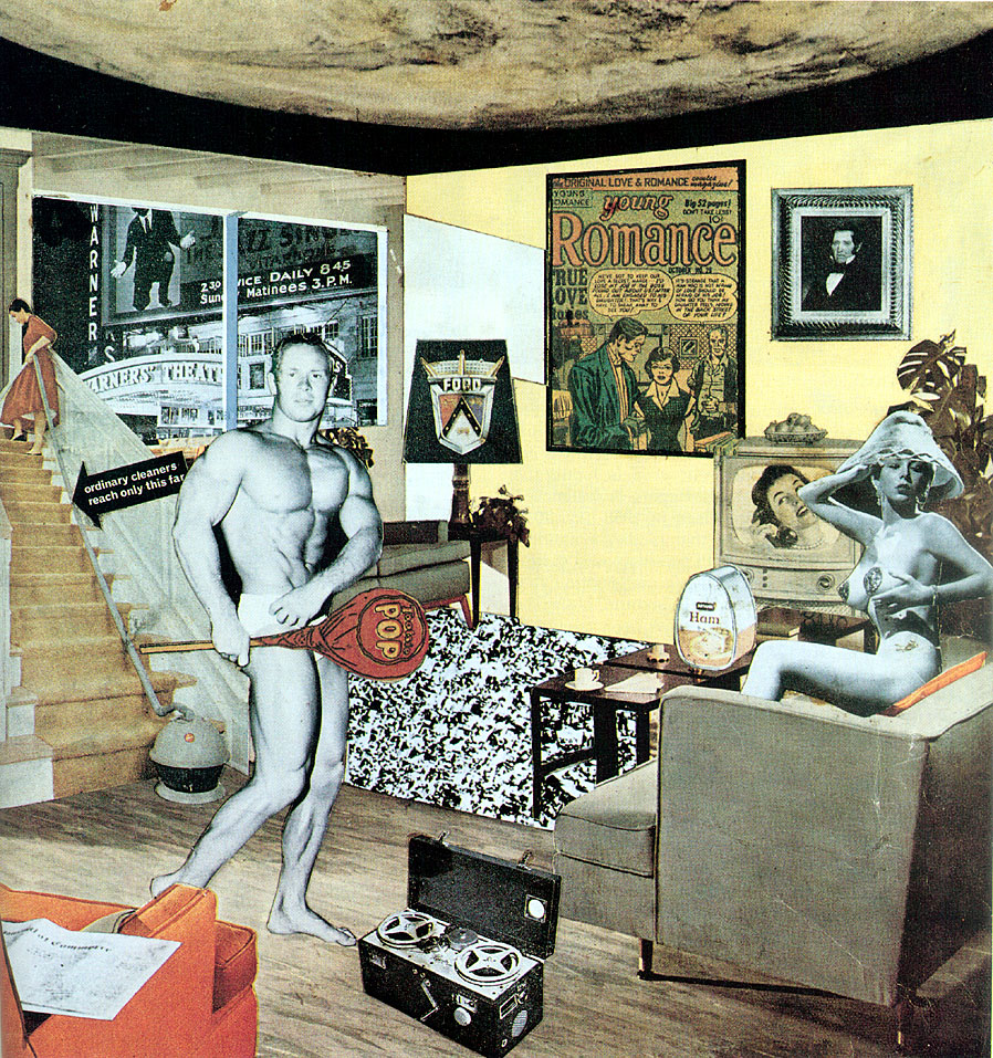
This work of Agnes Dechourchelle has shown some defined shapes and form as it has been drawn carefully which is exaggerated by the colours that is used to give an effect to what it is. She certainly knows the light and dark areas of this piece of work as the lighting takes place in which the colour yellow is combined with the shadows and creates a colour like orange, red and green.  She also makes a nice texture to the people she drew at the background as she uses the colour pencils in different ways which shows the roughness or the smoothness of the certain clothes and hair that is been drawn. She creates the object in the front to be vibrant which gives an impact of the theme of this work to be and to be eye-catching. She also creates a relaxed and cheerful atmosphere as the different colours shines through her work. I like her work as she is expressive with colour pencil she uses as it creates a specific mood to every work she does which is usually that lights up the mood and i really like working with colour pencils as it looks more interesting. I also have to admit that it isn't easy to just to use Colour pencils as you can’t erase once you drew it.

Monday, 28 November 2011

Evaluation (snowboard project)


When I first received this assignment, I found it very interesting project and seem to be excited about it. As I was doing the task which was given by the teachers , I was working steadily  and on time but soon I got  left behind as I wasn't up to date with my home work that was given which lead to be unorganized . I kept working as I went by the tasks that were given each time, no matter how far behind I was with my homework.


Firstly we started of doing the mark making and making prints which I found really appealing.The designs that came up for the printings were good so I turned them into snow board designs that might be my final design. The process of making snowboards was when I had a cut out of snowboard which I placed it on top of my prints and drew it around the snowboard cut –out a finally cut it out. I've also made snowboards out of magazines to make it my secondary source. I've researched on the artist that was given the teachers and drew a copy of it and researched the artist which was in the assignment brief. I've chosen to do three artists that would influence for my final design. I was quite satisfied with the designs that might be in my final design.


I’ve also found it hard to keep with the time as it explains why haven’t done my final design and that I’ve never had that short amount of time to  finish a project like that before.For this sake of it, I couldn't do my final design which is unfortunate but I managed to do some of my other to be done which was also more important. Well if had extra time, I would've certainly did my final design and would've produced a satisfactory work overall.  Next time I  get a assignment, I  will be  aware of the time I have  and will be organized  and try to do my homework as soon it is set.

Sunday, 20 November 2011

M.C Escher 2D

This piece of work from Maurits corneils Escher is about the staircases in different angle to make confusion looking. I think the artist trying to tell us that the stair case might be in different angles but the objects are the same, he trying to tell us the similarities and the differences. This structural piece of work is well executed as it seems that the artist had a lot of thought about this work and drew it. The drawing has an interesting aspect as the people can walk anyway they want to without falling from where they stand  which shows that his imagination for this piece of work has no gravity and it also creates this piece of work to be appreciated.

This piece of this of work has been drawn using pencils. The shape of this work has been accurately done and the shading of this work has shown the light and the dark areas.
Maurits Corneils Escheris known as M.C Escher in short and he was a Dutch graphic artist.
He was born on 17th of June 1898 and died on 27th March 1972. His first work was the still life and street in 1973. M.C Escher is an artist that creates his own work without having any direct observations. He is well known for his mathematically drawings.

I have chosen this artist as it is structural and very specific the way it’s been drawn. I also chose this artist as it is different and unique which would fit with my designs for snow board as it needs to be special in its own way.  I like how he created the people in the way it made sense.
                                                                                                                       
Quotations
By keenly confronting the enigmas that surround us, and by considering and analysing the observations that I have made, I ended up in the domain of mathematics, Although I am absolutely without training in the exact sciences, I often seem to have more in common with mathematicians than with my fellow artists.

Murakami Takashi 2D

This piece of art work from Murakami Takashi is about the flower ball showing us that each flower is individual as it has its own personalities which is expressed through the different colours and how it conveys the mood of the flowers. Each one of these flowers  dominate in their one way as each one expresses their own cuteness .The flowers are compact , which gives an unease impression but it also give as a great deal of sensation. The mood of this of work gives a happy, exciting and edgy feeling as the flowers give an uncomfortable feeling but it also gives a childish impression as he used vivid colours which makes you smile. I think this work is about the joy as the flowers are seen with smiles but on the other hand it’s kind of creepy as the closeness of the flowers are tightly together. By the view of these flowers, it gives an insight felling of their smell might be as their vibrant colours seem to be intriguing.

This is a painting and the materials that are used are acrylics. Murakami Takashi has used
bright colours and used a 3D shape to make the it a flower ball.

                                                                                                               
Murakami Takashi is a contemporary Japanese artist .he works with paintings and sculptures. As a young Murakami Takashi he was in inspired by manga and anime which lead him to have an ambition, to work in animation industry. He went to Tokoyo University of arts and learnt the essential skills for animation but as he went along with the traditional Japanese style of painting which includes various techniques and conventions however he became disappointed with the high expectation of the art world so he started to search contemporary artistic styles.  Murakami was born in 1962 and he published the theory “super flat”.

This links with my work as it is colourful and cartoonish which would look lively on snow board.
I like Murakami Takashi’s work as it conveys a specific mood by the viewer which
is something that I want my design for my snowboard to be seen as.
 
Quotations
“We want to see the newest things. That is because we want to see the future, even if only momentarily. It is the moment in which, even if we don't completely understand what we have glimpsed, we are nonetheless touched by id effect t. This is what we have come to call art.” 

Keith Haring 2D


In this piece of work I think the artist trying to tell us about the movement of these colourful character as they move in a sort of way that they are dancing or exercising. This picture creates energetic and fun mood as it contains movements and that the each character is different by their own movement and their own colours showing their individual personalities. The movement also shows the childhood times as it looks full of passion and excitement.

This piece of work is a painting. The colours that is used in this piece of work emphasis of what it is about  as the background colour yellow makes the colourful characters stand out individually .The use of bold colours gives an effect to be eye-catchy.


Keith haring was an artist that was doing about the New York City street culture in the 1980s.Keith haring was born on May 4th in 1958 and was born in reading, Pennsylvania. Keith haring studied graphic design in the ivy school of professional art. When he was 19, he moved to New York and found graffiti art interesting and learnt it in school of visual art. Keith haring died in his 30s and was on February 16th 1990. Hi first achievement was with the public as he did chalk drawings in the subways in New York. He started in 1980, having an exhibition in club 57. He died of aids.

This relates to my work as it has movement and that it’s colourful and fun. I like the simplicity of the work although it gives a big effect of the vibrant which makes it look interesting and attractive. The subject of this work relates to my work as my design is for a snowboard which involves movement and excitement as snowboarding is a lively sport.

Quotations

“I don't think art is propaganda; it should be something that liberates the soul, provokes the imagination and encourages people to go further. It celebrates humanity instead of manipulating it.”

“When it is working, you completely go into another place, you're tapping into things that are totally universal, completely beyond your ego and your own self. That's what it's all about.”

"The weird boxed and numbered [New York] space we live in is already fantasy. Artists have only to start with what's there and give it a few fillips fo the truly fantastic to emerge."
     - John Ashberry, Reported Sightings


Sunday, 2 October 2011

Evaluation


When I first received the assignments task, I was quite clueless as I didn’t really
understand the theme of this project but as I went to do the tasks that was set by
Teachers, I came around of understanding this specific topic and started to think further about this project. I started to collect my research using the internet, photographs and drawings. During my research, I found some artist more interesting than others as they inspired me and made think about my final design which might be on my final design. When designing my ideas for my final design, I picked the rose as I was inspired by Kara walkers work because I like how the black stands out from the white and  I’ve chosen stik’ s work of sticks  as I like the way he expresses emotion through the movement of the sticks. At first I was satisfied with my designs as they simply and were just what I wanted to be like but  I began to think that it was too basic,but by the time I knew it was I ran out of time to add more designs to my work.


When I came to do my final design, I found drawing in a bigger scale hard as they wouldn’t look the same as my final design on paper. Doing my final design on the board was something I never really
done before which is something new I’ve done in this project. While doing my final design, I had some difficulties to paint my work as I haven’t really thought about how I would paint the background through which lead me to rush my work and leave some blank space of board in between my name.
When I finished my final design, I wasn't really pleased with it as I didn’t paint it neatly and took my time wisely. I wasn’t really organised as I rushed most of my work during this project and if had more time to do this project I would be more organised and be more aware of the time I have left to finish a project to its deadline.

Overall I have enjoyed the assignment as I found the artists that I have researched very interesting and that it was different from the work I’ve done before.  

Thursday, 29 September 2011

Just what is it that makes today's homes so different, so appealing?- Richard Hamilton

Subject matter

This piece of art work is about how different the house is compared to others as he showed us how homes can be so much interesting as he decided to create a unusual attractive home using
All sorts of interest that people in 1955 might be interested such as the body builder ‘Irvin Zabo' and the artist Joe Baer when she was young back in 1955. This is where the word appealing comes from as celebrities strike people to be attracted and to be fascinated. This piece of work seems about fame as he added celebrities and also romance as he added a comic page called young romance.

Technique

Richard Hamilton used American magazines to get different pictures of all sorts of things for his work. He got cut outs of the pictures and placed them the way wanted and then stuck them.

Artist’s career

Richard Hamilton was born in Pimlico, London England on 24 February 1922 and died on 13th September 2011. He is a painter and collage artist. Richard Hamilton didn’t have qualification
So he decided to do apprentship in electrical components firm which is where he found out that he was good at drawing. Knowing he had that talent, he went at St Martin’s school of art.


Links with own work
I've chosen Richard Hamilton to link with my work as I like how he uses varied and unusual
Images together to make his art work and how he develops his images into a fantasy story which is made in a creative way.

Quotations

“Popular (designed for a mass audience);transient(short term solution); expendable(easily forgotten);low costs; mass produced; young (aimed at youth); witty ;sexy ;gimmicky ;glamorous and last but not least Big Business”. (Quoted in History of collage by Eddie Wolfram).

Street Artist - Stik


Stik’s works of boldness and the simplicity of the stick shows a great deal of body language and emotion.  I like Stik’ s work as he finds beauty in the movement which suggest the body language, when you move in a certain way it shows that you are happy, angry etc. I like the vulnerability of Stik’s work as it shows the emotions thorough when he was homeless person. Using just plain vivid colours for the background makes it look outstanding.
I like this work of Stik as it shows that the stick is lonely and makes a statement through the body language and the emotion being sad which suggest the eyes shut.

Gone, An Historical Romance of a Civil War as it Occurred Between the Dusky Thighs of One Young Negrees and her Heart- Kara Walker


Subject matter

The subject matter of this work of Kara walker seem to show about the American civil war as she used ‘Gone’, the first word for her title from Margaret Mitchell’s 1936 novel
‘Gone with the wind’. The importance of this piece of work seems to be the race, sexuality and slavery. This work seemed to be stereotypically about black history. The mood of this work seem to be relaxed and romantic. The artist is telling us how it must been at times like civil war and how black people have been treated as slaves and knowing the tough times in the past which she put it through in this specific art work.

Technique

Kara walker’s technique of this work is simply is the cut outs of black paper which is stuck against a white background. Kara walker discovered that silhouettes were the perfect way to show the racism and the sexism of stereotype of everyday life .Kara walker chose to do the silhouettes as it is about not knowing the subject properly which gives us to figure out what it is really about.

Artist‘s career

Kara walker is an African American artist whose works is about the race and sexuality, violence and slavery.  Kara walker was born In Stockton, California on November 26th 1969. She went to Rhode Island School of Design. Kara walker exhibited her work in various places such as the Apartheid Museum in Johannesburg, the renaissance society in Chicago, the museum of modern art in new York, the San Francisco museum of modern and lots more.

Linking with own work

I’ve chosen Kara walker to link with my work as I like the how the story is told without having any detail from her piece of work which leads it to be more interesting to get know about her specific work. I also like the boldness of the black silhouettes which stands out from the white background.

Quotations

“I was overcome by the need to re-create a race based conflict, a need to feel a certain amount of pain…only problem is that I am too aware of my overzealous imagination interfering in the basic facts of history…A collusion of fact and fiction that has informed me probably  since day one”.